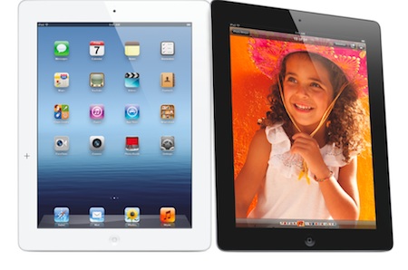
It’s simply called the “iPad”. There is no special name to mark it as the third in Apple’s tablet series. It’s a touch thicker and heavier, but manages to look and feel the same as the iPad 2. It’s computing power hasn’t changed, but with faster LTE (4G) internet access and an improved graphics chip it can seem to perform faster.
An iPad 2 owner isn’t going to notice much of a difference until they load up a photograph, movie, or book page. There’s an awakened clarity to the way the new iPad handles visual content that will make photographers flip.
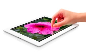
You really notice it when you pinch-and-zoom into photographs or web articles. The zoomed version of the image is just as sharp and clear as the original. With a resolution of 2048 x 1536 I found that book pages and web fonts were very crisp, that photographs and movies offer clearer details.
The iPad isn’t faster at loading apps, but anything with a visual flourish, such as the way pages curl when you turn them in iBooks, moves with more speed and smoother motion. It can seem as if some tasks happen faster.
The demo units offered by Apple today were connected through Wi-Fi, so I can’t speak to how well the faster LTE connection will perform, but from my experience with other LTE products offered in Canada, the leap will be seen in downloading or streaming video and other media content.
Both the front and back cameras now offer face detection, auto focus, and automatic white balance which offers a noticeable improvement even if it’s only the iSight camera on the back that delivers a 5MP upgrade. The back camera also seems to have a wider-angled lens too and as part of the new graphics upgrade, can now record in 1080p High Definition, although the iPad’s large size makes for an awkward camera to work with in general.
As is often the case with Apple products, the new model may not seem like much of an upgrade now, but as the new hardware fuels new apps and software the gap will grow. We certainly get a hint of that with iPhoto.
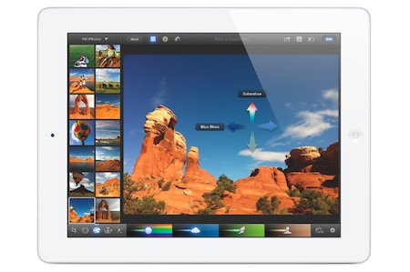
Although released for the iPhone 4 and iPad 2, iPhoto is really designed with the iPad in mind. By just touching and holding a spot on a picture, you can pull up options to slide your finger to apply changes in contrast or brightness that radiate outwards from your finger.
When you select a brush tool, you can lightly sweep an area of an image and lightly apply effects, all without having to go through a stage where you first select or scribble on an area. It’s very intuitive and really powers a level of sophisticated editing now possible thanks to the retina display.
I feel that the iPad’s benefits are really geared towards photographers more than anyone else. It’s a powerful tool for quickly reviewing photographs in detail on-the-go and you can now use photo-editing apps with serious purpose.
iPad 2 owners, of course, should be happy where they are and for those who haven’t made the leap to a tablet, the visual tweaks merely make it more compelling to do so.


Pingback : Kris Abel » App Reviews: Readability, Monty Python Holy Days, Better Book of Bacon